GOAT is a leading online sneaker marketplace with a strong following among sneaker enthusiasts and streetwear fans. For this self-initiated UX case study, I chose to redesign GOAT’s website to improve the overall user experience, simplify the buying process, and bring clarity to the interface without compromising its unique visual identity. The project involved user research, persona development, wireframing, a refined style guide, and a high-fidelity prototype to bring the redesign vision to life.
User Research & Persona
To guide the redesign with real user insight, I conducted in-depth interviews with my target audience. These conversations uncovered their tech comfort levels, shopping habits, and frustrations with current e-commerce platforms like GOAT. I asked about their backgrounds, daily digital routines, preferred devices, and standout shopping experiences.
From this research, I developed a user persona representing a tech-savvy, style-conscious shopper who values speed, simplicity, and clear product information. This persona helped anchor my design decisions around usability, familiar patterns, and reducing friction without losing GOAT’s bold brand identity.

Problem Statement
Through user feedback and personal evaluation of GOAT’s existing site, I identified three key problem areas:
1. Homepage
The homepage layout is unconventional, which leads to confusion. While GOAT aims to stand out, its lack of visual hierarchy and non-standard layout can make the site feel overwhelming to new users.
Goal: How can I make the homepage more intuitive and familiar while maintaining a strong visual identity?
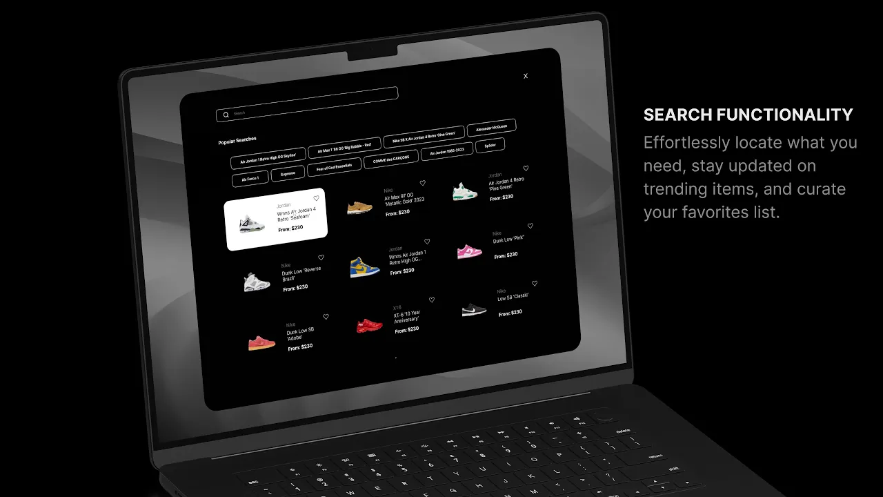
2. Search Experience
Users often struggle to see results clearly or refine their searches effectively. The search UX lacks the speed and clarity users expect from modern e-commerce platforms.
Goal: How can I help users find exactly what they’re looking for faster and with less friction?
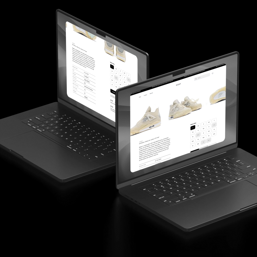
3. Product Page
The current product page makes users jump through unnecessary steps to view key product information like sizing, availability, and details.
Goal: How can I streamline product pages so that sizing and availability are immediately clear?
Wireframes
I created wireframes to structure each page based on the updated goals. These mapped out content, functionality, and interactive elements across the: homepage, search results page, product detail page, & sign-in and user account flows
These wireframes helped visualize layout changes early in the process and laid the foundation for design and interaction improvements.


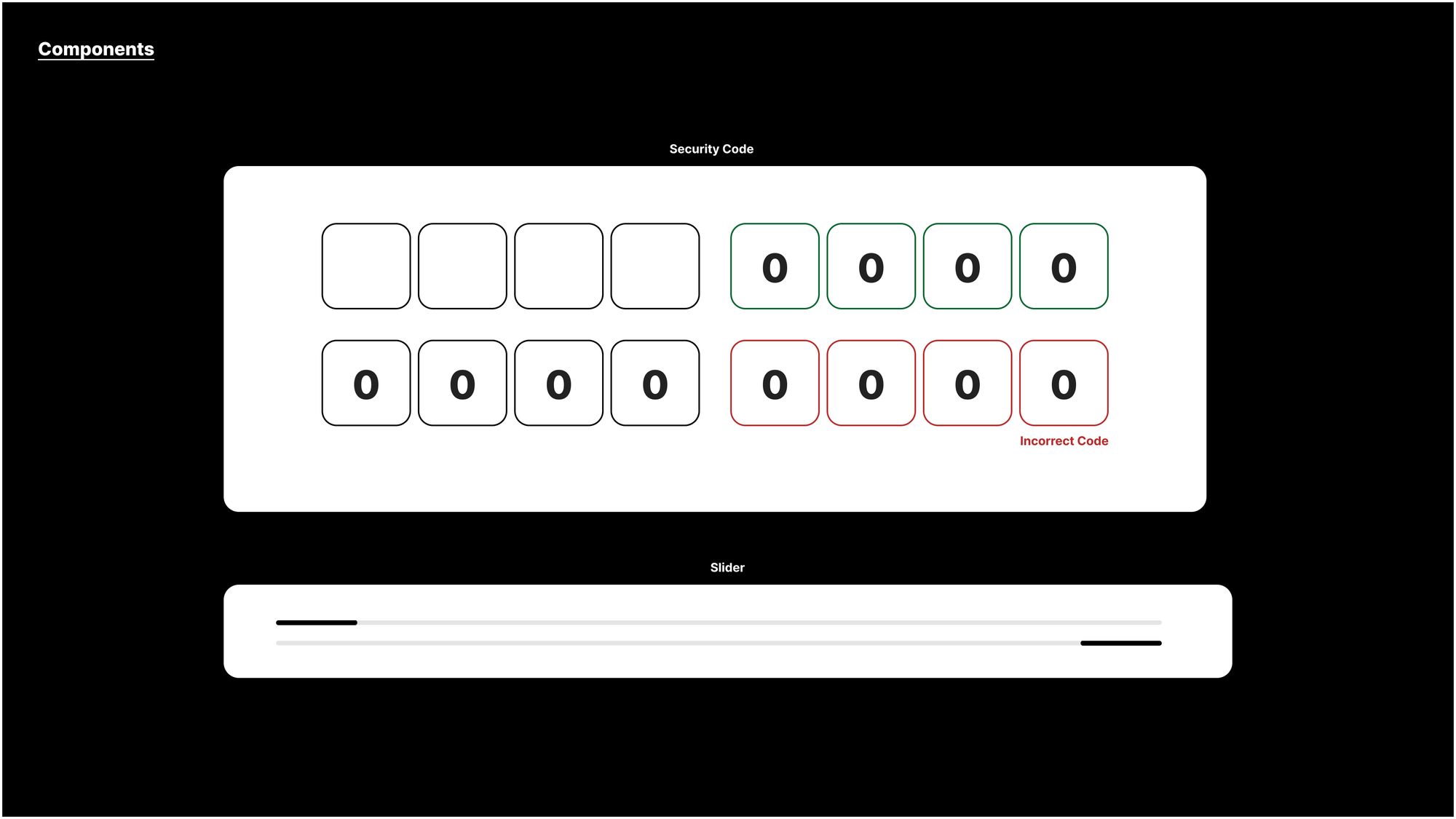
Style Guide
To ensure consistency, I developed a cohesive style guide that includes:
Updated color palette for a more modern, legible look
Clean, readable typography
Simplified iconography and button styles
UI components designed for responsiveness and clarity
The style guide was informed by GOAT’s current branding but refined to improve usability and hierarchy throughout the shopping experience.


Final Design & Prototype
Using the style guide and wireframes, I built a high-fidelity prototype that brings the redesign to life. Key features include:
A simplified, focused homepage that highlights categories, trending drops, and key search paths
A more dynamic and filterable search experience
Product pages that surface size availability, condition, price, and buying options without the need to click through multiple layers
This prototype demonstrates a smoother and more intuitive user flow while preserving the brand's sleek, modern edge.
Results & Takeaways
While this was a conceptual redesign, the process taught me the value of:
Starting with real user input
Focusing on simplicity and familiarity in UX decisions
Aligning design with user expectations without losing brand identity
GOAT’s redesign is a project that balances strategy and style, and reflects my ability to lead a product from user research to functional, beautiful design.