Overview
DynastyLab AI solved a $70+ game's biggest UX problem: players were making terrible upgrade decisions because they couldn't see the math behind 200+ upgrade paths. By building a custom efficiency scoring model and wrapping it in an intuitive dashboard, I created a tool that improved player decision making while demonstrating core BI and product management principles.
—————————
The Problem
"What should I Upgrade?"
Dynasty Mode forces players to allocate Skill Points across 1,000+ upgrade paths with zero decision support. Players see options like “5 SP for +3 Speed” or “12 SP for Silver Strong Grip,” yet the game offers no way to compare value, evaluate efficiency, or plan a progression strategy. This leads to wasted SP, inefficient builds, and frustration with high-cost abilities that offer unclear value.
—————————
Technical Approach
Data Architecture
I built a SQLite database to store upgrade paths, costs, and tier requirements across all player archetypes. The schema captures:
Upgrade costs by archetype and tier level
Attribute thresholds required for tier progression
Attribute increase requirements for each upgrade path
Scoring Model Development
The breakthrough was building a scoring system that weighs cost vs. benefit while accounting for diminishing returns:
Key components:
SP Weight/Attribute Weight: User-configurable to prioritize cost vs. performance
Difficulty Modifier:
1 + (Final Attribute / 100)to account for diminishing returns at higher tiersNormalization: Scores scaled 0-100 for intuitive interpretation
Difficulty Adjustment Problem
The major challenge was that not all attribute increases are equal. A +5 increase from 60→65 is fundamentally different from 90→95. My solution applies a difficulty multiplier based on the final attribute value, ensuring high-tier upgrades are appropriately penalized for their increasing marginal costs while preserving their true strategic value.
Weighting System Design
Rather than forcing a single optimization approach, I implemented user-configurable weights:
0.0 (Attribute-focused): Prioritizes attribute increases regardless of cost
0.5 (Balanced): Optimal for most players seeking value upgrades
1.0 (SP-focused): Maximizes progression per SP spent
Data Integrity Considerations
Analysis revealed scores naturally clustering in the 71-100 range. Rather than artificially expanding this to fill 0-100, I preserved the natural distribution because it authentically represents real upgrade efficiency patterns and maintains user trust through transparent, meaningful scoring.
This model revealed that mid-tier upgrades (Silver → Gold) often delivered better value than premium upgrades, which was essential for users determining if upgrading to higher tiers was worth it.
—————————
The Solutions & Product Features
AI Assistant Integration
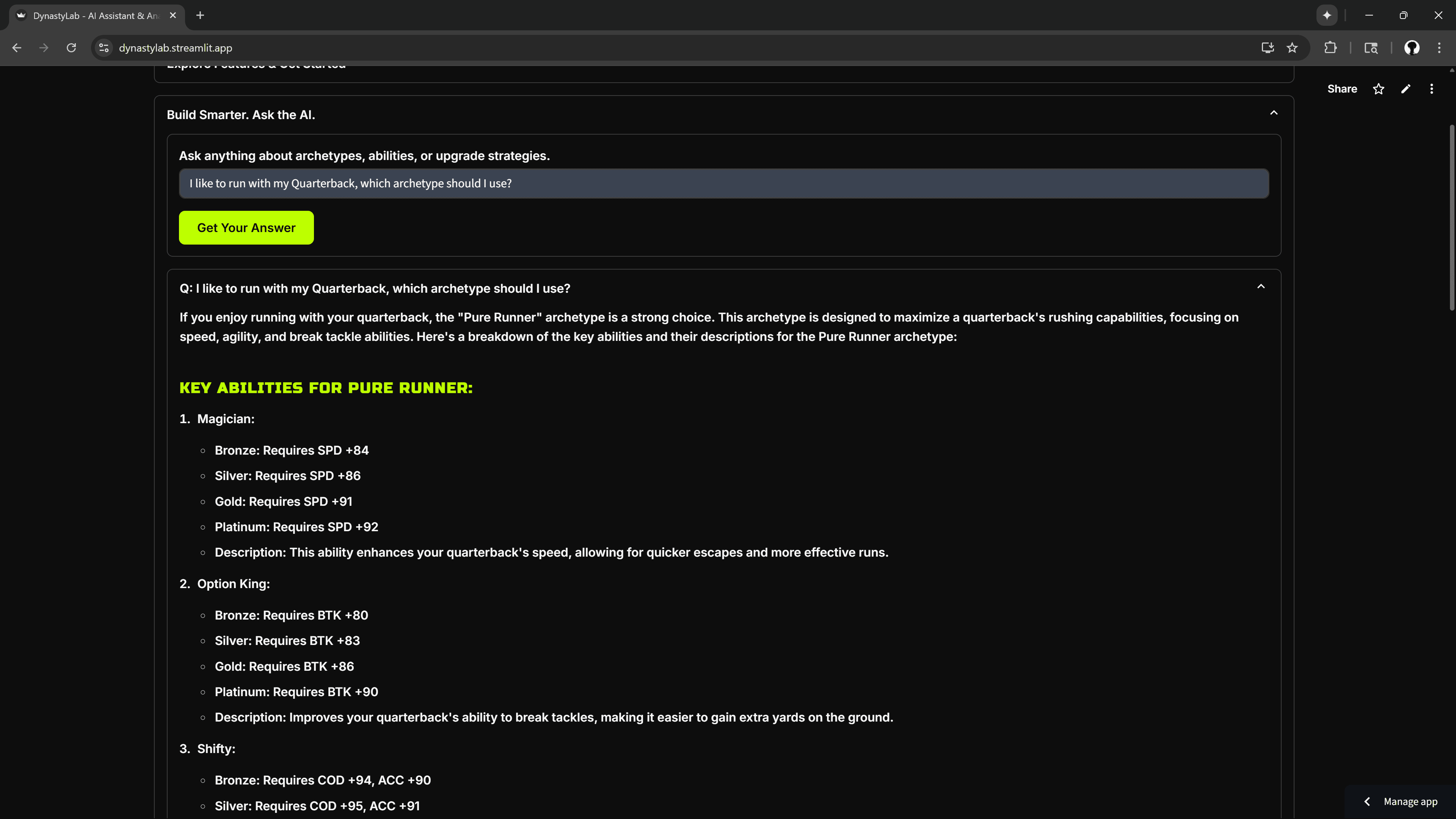
Players needed instant answers to complex upgrade questions like "What's the best way to spend 15 SP on a Speedster?" without manually comparing hundreds of upgrade combinations.
I built an AI assistant that connects directly to the efficiency scoring model, turning natural language questions into data-driven recommendations. When users ask complex queries about budget constraints, archetype synergies, and tier planning, the AI processes these against the same algorithms powering the visualizations.
Technical Implementation:
Integrated OpenAI API with the efficiency scoring database
Enabled multi-factor analysis through conversational queries
Maintained consistency with the visual tool's recommendations
Players can now get expert-level upgrade advice through simple questions, making advanced optimization strategies accessible to casual users who don't want to analyze charts.
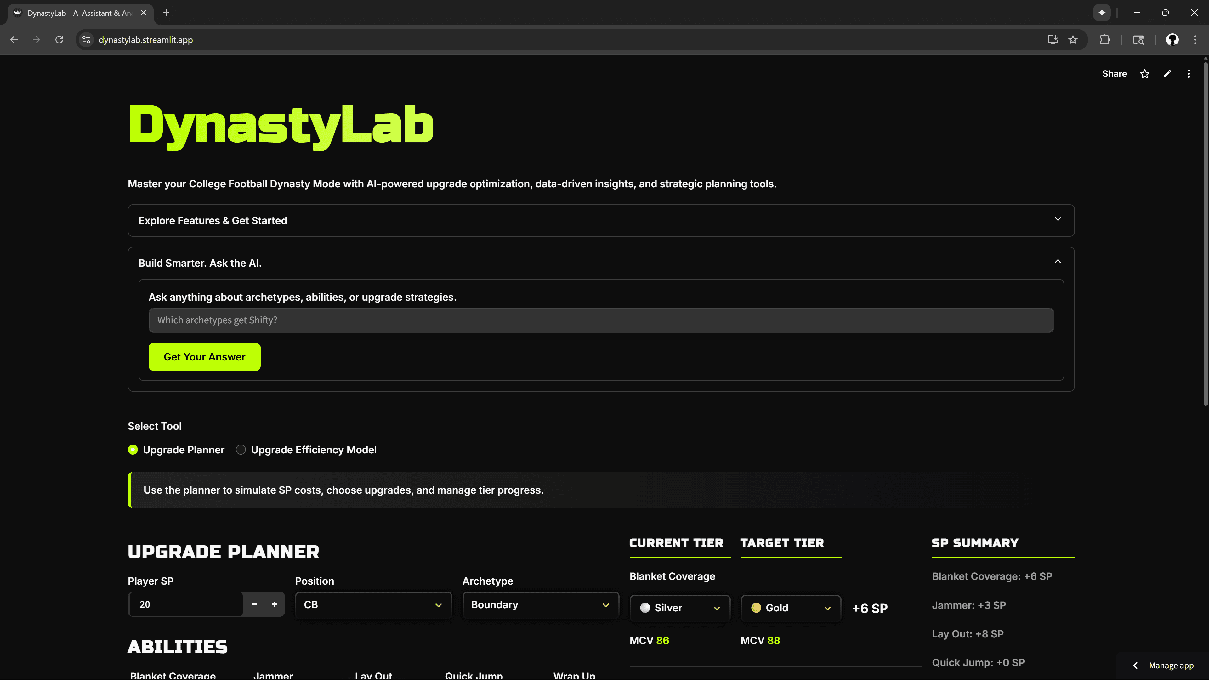
Upgrade Efficiency Analyzer
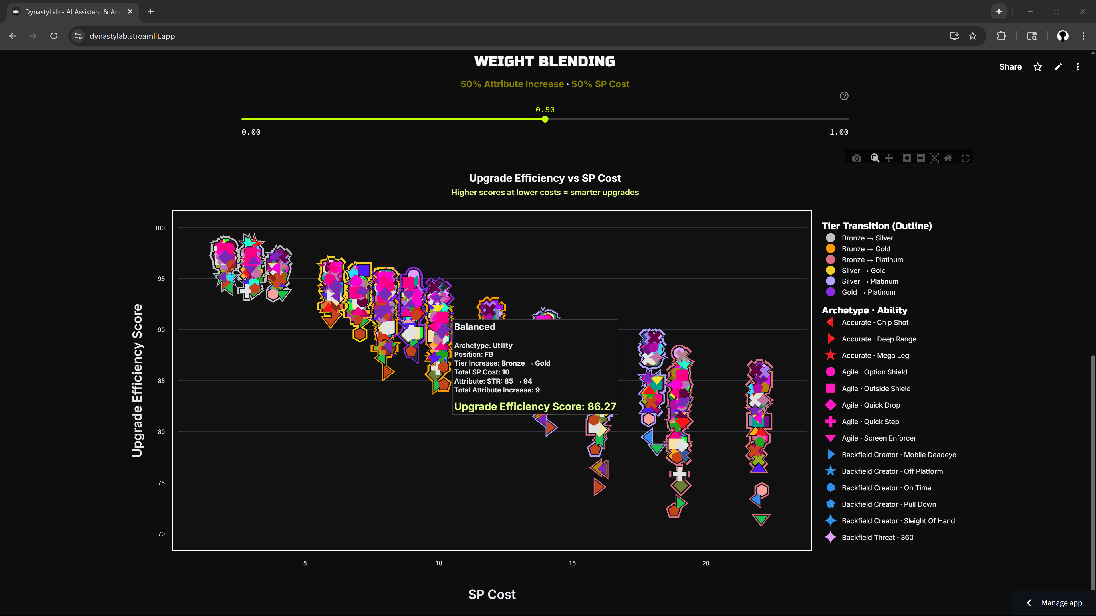
I built a dynamic scoring system that weighs cost vs. benefit while accounting for diminishing returns at higher tiers. Users can adjust the weighting to match their strategy - some want maximum bang for their buck, others want to see attribute increases regardless of cost.
Technical Implementation:
Difficulty adjustment algorithm that penalizes high-tier upgrades appropriately
User-configurable weighting system (0.0 = stat-focused, 1.0 = budget-focused)
Three visualization modes revealing different strategic insights
Interactive charts that surface counterintuitive optimization patterns
Visualization | Purpose |
|---|---|
Efficiency vs SP Cost | Optimized for budget-conscious players seeking maximum value per skill point spent |
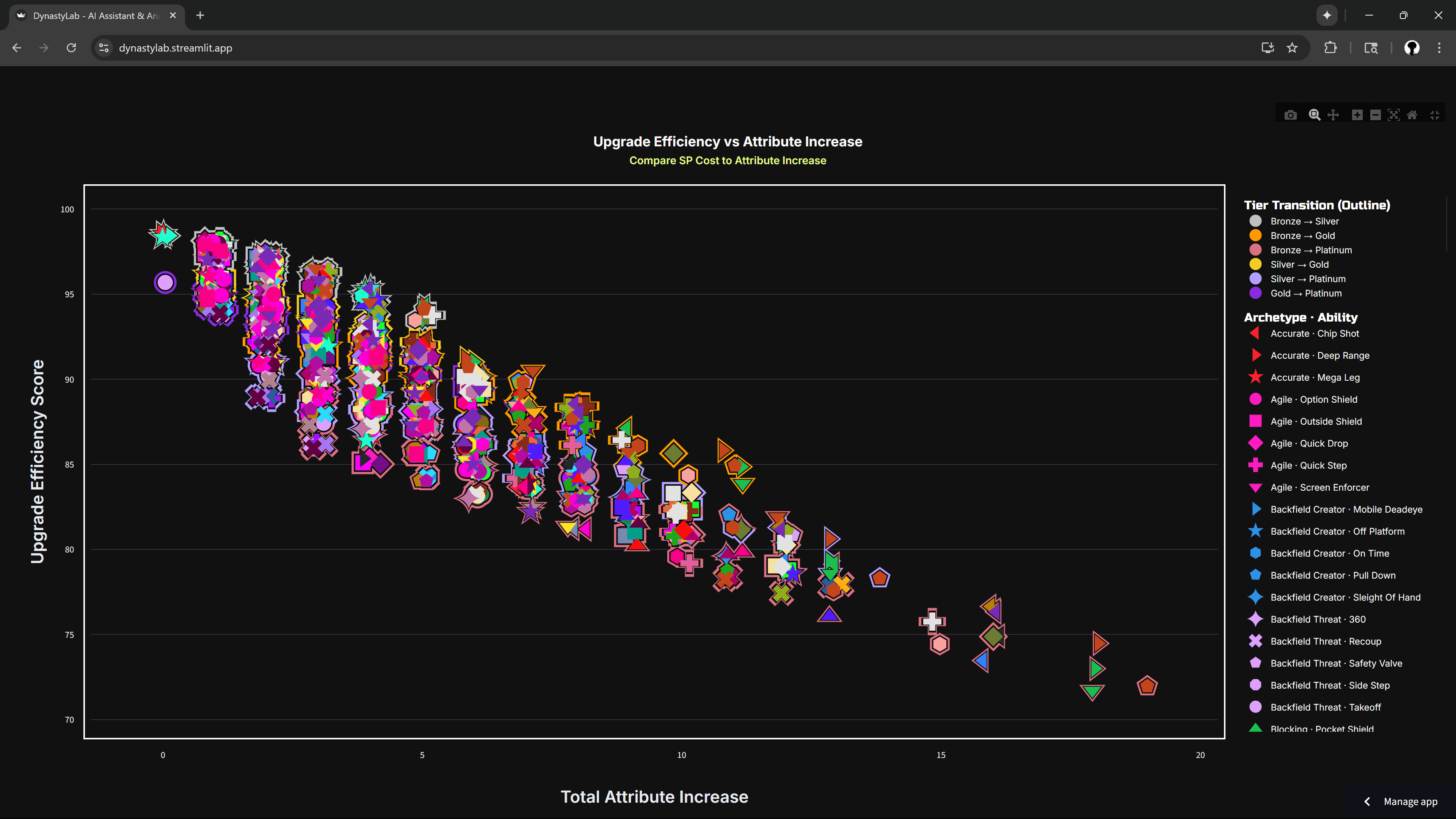
Efficiency vs Attribute Increase | Designed for players prioritizing attribute increases over SP cost considerations |
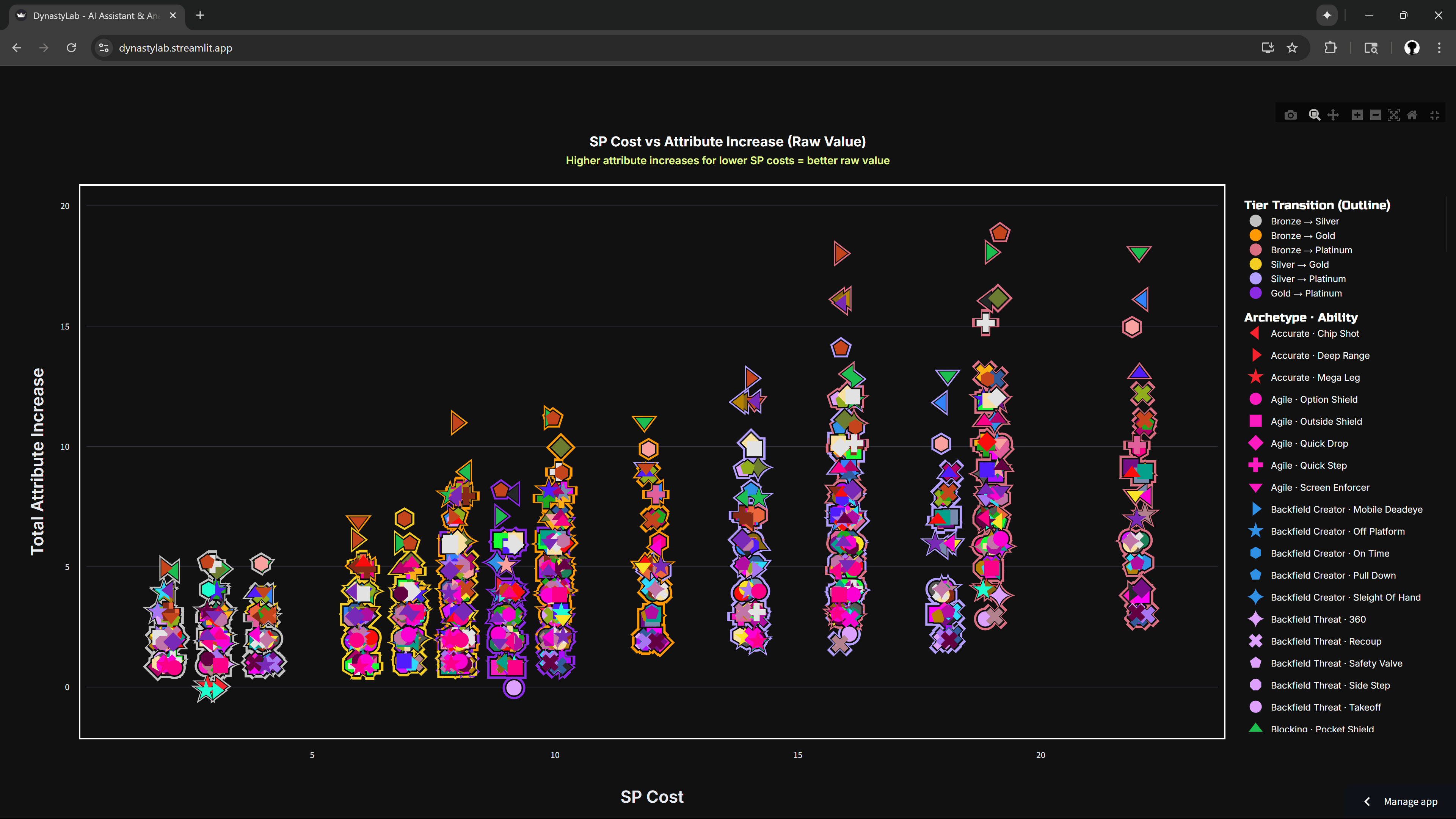
SP Cost vs Attribute Increase | Provides unbiased cost-benefit analysis without efficiency scoring influence |
Efficiency vs SP Cost

Efficiency vs Attribute Increase
SP Cost vs Attribute Increase
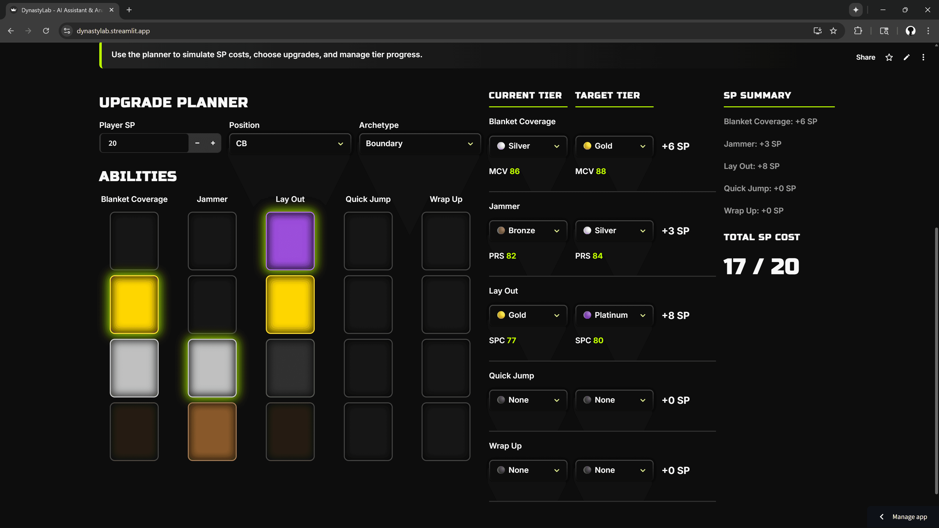
Tier Progress Visualization
The upgrade planner shows visual progress bars for each tier, with SP costs and attribute thresholds clearly marked. Users can simulate upgrade sequences before committing resources.
—————————
Design Decisions
Looking at the interface, I designed it to feel like a premium gaming analytics tool rather than a generic business dashboard:
Signature neon green branding that immediately signals "lab" and "analysis" while maintaining gaming credibility
Dark theme with strategic accent colors: The interface uses deep blacks with electric green highlights, creating visual hierarchy without overwhelming the data
Ability grid visualization: Color-coded squares (bronze, silver, gold, platinum) provide instant visual feedback on upgrade status and tier progression
SP cost displayed large and clear, making budget management intuitive
Three-column layout: Current tier, target tier, and SP summary create a logical left-to-right progression story
Color-coded tier dropdowns: Each tier level has its own color (bronze, silver, gold, platinum) for instant recognition
Interactive Design Elements
Real-time SP calculations: As users select upgrades, costs update immediately in the right panel
Hover feedback: The ability grid provides immediate visual response to user interaction
Weighted slider control: The prominent green slider lets users adjust efficiency calculations dynamically
The result feels like a professional esports analytics tool that serious players would actually want to use, bridging the gap between data analysis and engaging user experience.
—————————
Impact & Insights
Key Findings That Changed How Players Approach Upgrades
Archetype Efficiency: Speedsters deliver 23% higher attribute gain per SP compared to Power archetypes
Tier Optimization: Silver → Gold transitions offer 34% better efficiency than Gold → Platinum on average
Diminishing Returns: Upgrades beyond 90 attribute points require exponentially more SP for marginal gains
User Behavior Changes
The tool shifted user strategy from intuition-based to data-driven decision making. Dynasty players began using efficiency metrics to better determine how to upgrade their team to give themselves a competitive advantage.
—————————
Technical Stack & Implementation
Frontend: VSCode, Python, Streamlit for rapid prototyping and deployment
Data Processing: Pandas for ETL and analysis
Database: SQLite for lightweight, portable data storage
Visualization: Plotly for interactive, publication-quality charts
AI Integration: OpenAI API for contextual recommendations
Deployment: Streamlit Cloud for accessible demo hosting
—————————
Outcomes & Reflection
This project showcases how I can:
Identify product opportunities in existing user workflows
Build scalable data models that balance complexity with usability
Design intuitive visualizations that drive decision-making
Integrate AI capabilities to enhance rather than replace human judgment
The combination of quantitative analysis, visual design, and product thinking mirrors the skills needed for modern BI and product roles. I approach every project by understanding user needs first, then building the minimum viable solution that delivers maximum insight.
—————————
Project Links
GitHub Repository:
https://github.com/jemarisappLive Demo:
https://dynastylab.streamlit.app