Case Study
SoundIntel BI
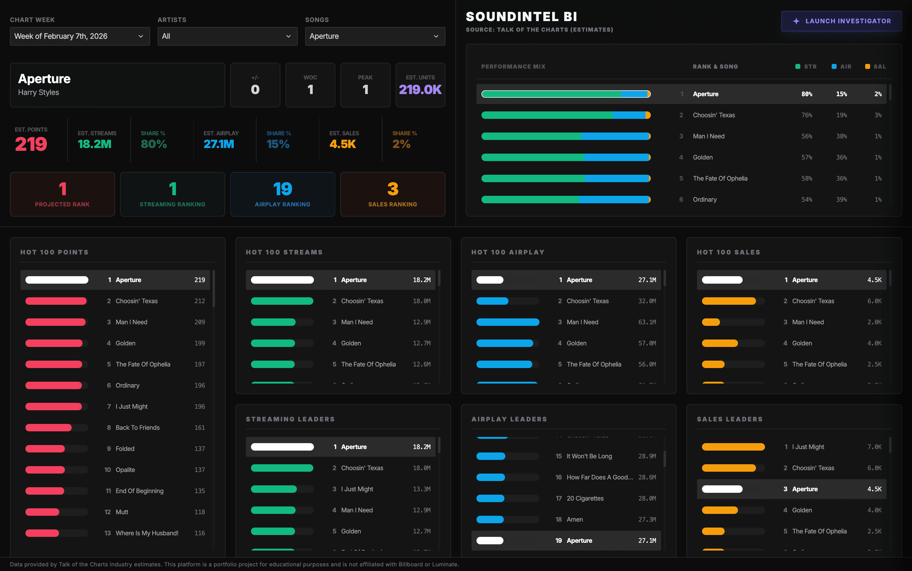
An interactive music analytics platform combining business intelligence dashboards with AI-assisted data exploration.
Outcome
Reduced chart interpretation from minutes of reading to seconds of scanning and enabled ad-hoc questions that previously required custom views.
- Project Type
- Business intelligence and AI-assisted analytics
- My Role
- Product engineer
- Users
- Music analysts, operators, and decision-makers
- Origin
- Power BI prototype evolved into a custom web platform
The Analytics Problem
Music chart data is shaped by multiple performance drivers, including streams, airplay, and sales. Static tables and traditional BI layouts can make it hard to understand what changed and why.
The product opportunity was to make dense chart data faster to scan, easier to compare, and more explainable for ad-hoc analysis.
Intended Users
The experience is designed for users who need to understand chart movement quickly: analysts, operators, and decision-makers who need both high-level scanning and deeper exploration.
Data Model
The platform organizes chart position, metric categories, and performance drivers into a dashboard structure that supports comparison and filtering.
The original Power BI prototype helped validate the analytical model before the experience moved into a custom web interface.
Dashboard Design
The dashboard prioritizes clarity over density. It separates ranking, performance drivers, and comparative views so users can move from scan to explanation without leaving the page.
AI-Assisted Exploration
The Ask the Data experience supports conversational analysis. The AI layer is framed as an explainer that helps users understand what is happening and how metrics compare, rather than as an automated decision-maker.
Product and Design Decisions
- Moved beyond Power BI constraints to gain control over layout and interaction
- Separated metric categories so users could scan performance drivers quickly
- Positioned AI as an analyst/explainer rather than a strategist
- Balanced information density with readability
Key Technical Decisions
- Used a custom web interface for more flexible dashboard composition
- Structured data around chart rankings and performance drivers
- Connected backend APIs to dashboard and AI exploration flows
- Kept AI responses contextual to the chart data being explored
Outcome and Lessons Learned
The project demonstrated how AI can enhance business intelligence through explainability rather than full automation. It also showed the tradeoff between fast BI prototyping and the flexibility of a custom product interface.
Technologies and Capabilities
Outcome
- Reduced chart interpretation from minutes to seconds of scanning
- Enabled ad-hoc analysis that previously required custom views or manual calculations
- Showed how AI can support BI by explaining data patterns
- Combined data engineering, UI design, and applied AI in one product